Hui Quan Ju
A Niche in The Temple of Fame
Client
Hui Quan Ju
Typology
Brand Identity, Print
Year
2017
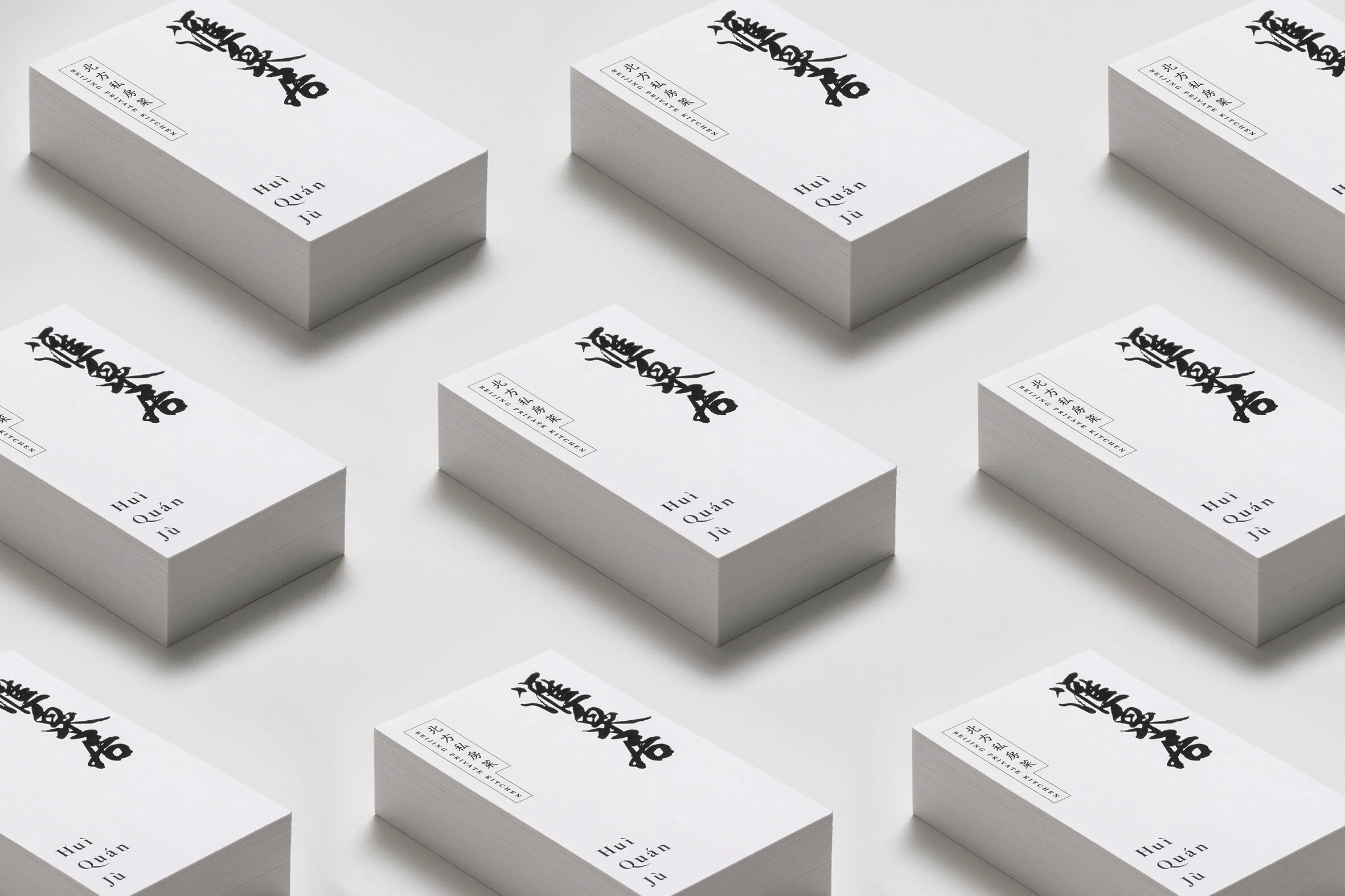
“Hui Quan Ju” is a Northern Chinese restaurant in Hong Kong. Its name has the meaning of spring water interchange, implies customer flooding the restaurant. The shop owner wanted the logo to present the personality of the Northern Chinese, which is tough, frank and detail-minded. Meanwhile, to give the idea of the exquisitely prepared and delicious Northern food.
Kwan decided to apply Chinese Calligraphy to the project as it is the core of Chinese culture. Word is the most direct expression of feelings, at the same time, it is also the basis of different cultural development like an interchange. Kwan believed that the audience would be able to feel the sparks of the calligraphy and the design concept, if the calligraphy was expressed perfectly along with the right weight of the brush stroke, and the right level of tension of the space.
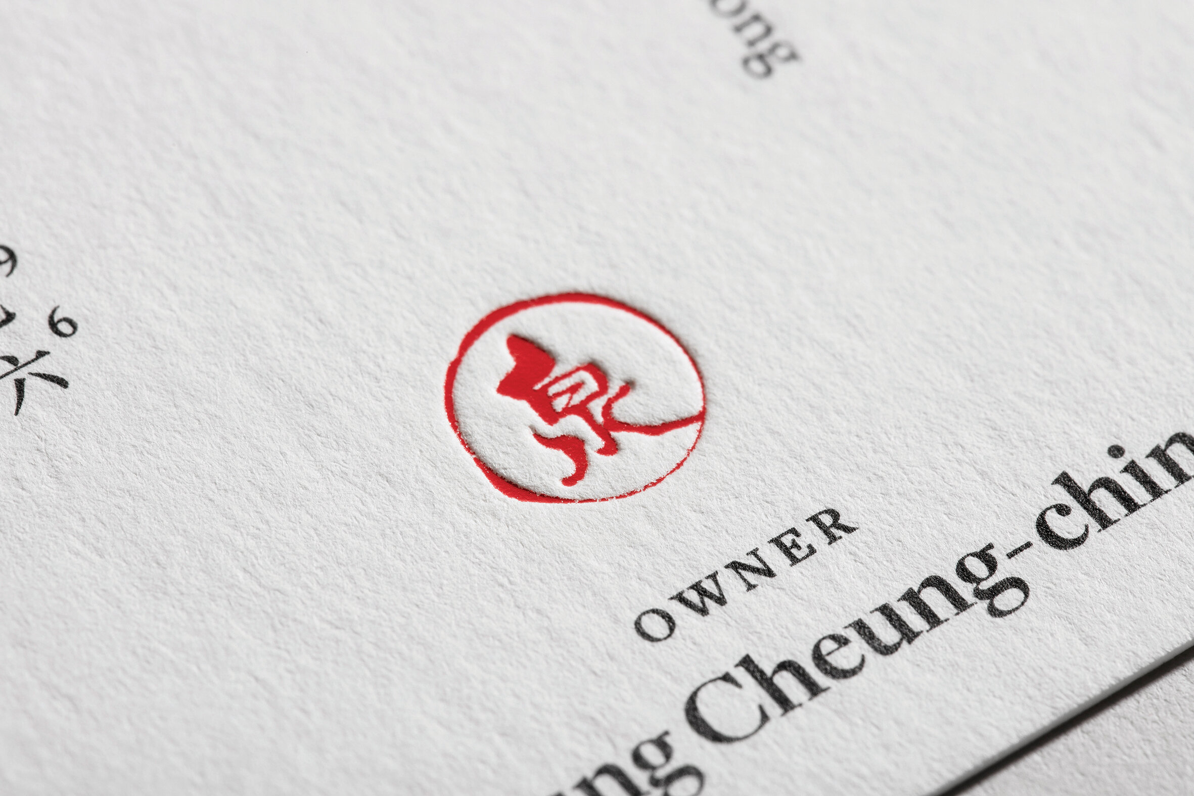
The workmark was hand-written by Wah Guo, a famous calligrapher in Hong Kong for local movie title display calligraphy. Using the semi-cursive script as basis and embellishing with a light dry brush stroke, the logo has already told a lot of stories by itself. Last but not least, Kwan left some white space for the business card on purpose after putting the calligraphy in, in order to emphasize the beauty of emptiness. At the same time, he created a stamp with the word “泉” (Ju), to make the business card look like a traditional Chinese painting, and to implied the restaurant could be a niche in the temple of fame.


